Sophia's Creations
Sophia’s Creations is a local luxury candle and fragrance brand known for its natural scents and handcrafted detail. When Sophia reached out, she was selling through Facebook and ready to take the next step in growing her business. To support this, I designed a website that allows customers to easily browse and shop her full product range. Alongside the website, we worked on a complete rebrand that included a new logo and a set of product labels that feel elegant, consistent, and true to her brand. To bring everything together visually, I also styled and photographed the products to capture the warmth, beauty, and atmosphere that define Sophia’s creations. The result is a thoughtful and inviting online space that reflects the care and creativity behind every candle.


Pamela's Campaign
Pamela Storey, current Chair of the Waikato Regional Council, commissioned the design of an A5 campaign flyer to connect with her constituents and communicate her values, experience, and dedication to the region. Working within her established brand system and teal colour palette, the flyer was designed to reflect Pamela’s versatility and strength across both rural and urban communities. The layout and imagery were carefully chosen to highlight her role as a strong, trusted voice for the Waikato, someone who brings proven leadership and a deep understanding of local needs. The result is a clear, engaging piece that reinforces her commitment and credibility as a regional representative.


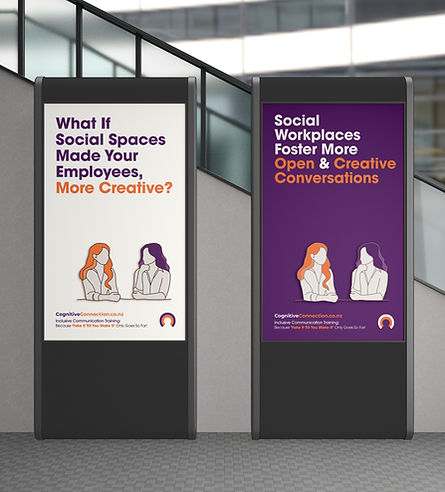
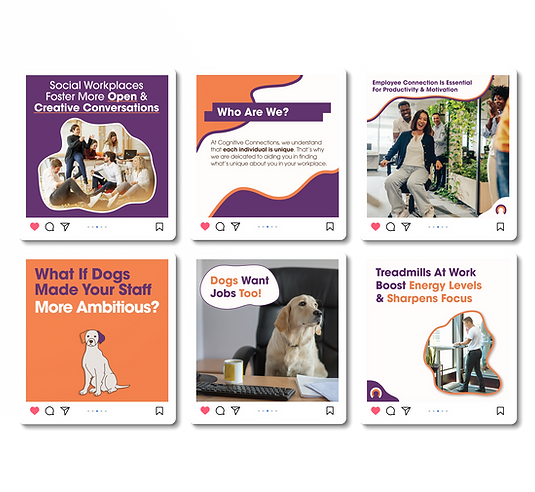
Cognitive Connections
Cognitive Connections is a workplace training company transforming how businesses support and empower their teams, especially those who are neurodivergent. They go beyond traditional upskilling by helping companies understand and optimize the entire system; people, processes, and culture. Our flagship offering is a one-day, in-person course that helps employees identify their strengths and challenges. Each team member receives a personalized working profile, enabling leadership to align tasks and projects to both individual talents and company goals. This tailored approach boosts productivity, enhances project outcomes, and increases employee retention, ultimately saving time and money. But the impact doesn’t stop there. By fostering more engaged, fulfilled employees, Cognitive Connections helps build healthier, more connected communities beyond the workplace. The branding for Cognitive Connections was intentionally designed to stand out in the corporate landscape. Steering away from the conventional blues and greens typically associated with workplace training and consulting, a vibrant palette of purple and orange was chosen to reflect the company’s unique positioning and values. Orange was selected for its associations with creativity, energy, and innovation, qualities that reflect the dynamic and forward-thinking nature of the business. Purple, on the other hand, conveys wisdom, individuality, and a sense of distinction, aligning with Cognitive Connections’ focus on neurodivergence and systemic change. The use of a clean, modern sans serif font helps establish professionalism and trust, key attributes when working alongside corporate clients. The balance between bold, unconventional colours and a classic, accessible typeface reflects the core essence of the brand: innovative yet grounded, inclusive yet professional, and above all, human-centred.


The Real Foods Project
These pages are from a recipe book I designed . The project was inspired by the charm and character of a classic cookbook, the kind you might find tucked away in your grandma’s kitchen. I wanted to capture that sense of warmth and nostalgia while still creating something clean, modern, and easy to use. The design brings together soft textures and vintage elements with clear, structured layouts that make the recipes easy to follow. Every choice, from the typefaces to the colour palette, was made to create a feeling of comfort and familiarity, while still keeping the design fresh and practical. A key focus of the project was accessibility. The book was carefully designed to support people who may find reading and following recipes difficult, including those with dyslexia or ADHD. The layouts are simple, the steps are broken down clearly, and the text is easy to navigate. This thoughtful approach helps reduce distractions and supports a smoother cooking experience. The final result is a book that feels at home on the kitchen bench. It is both practical and inviting, made to be used and enjoyed by anyone who loves to cook, no matter their background or needs.


Fashion Look Book
This Look Book was a collaborative project created in partnership with fashion and photography students at Ara. The goal was to showcase the fashion students’ original collections in a way that celebrated their creativity while presenting their work in a professional and visually engaging format. As the designer, I worked closely with each team to ensure the layout supported and enhanced the story behind every collection. The design uses strong visual flow, generous white space, and carefully chosen typography to give each piece room to breathe while maintaining a cohesive overall look. The Look Book balances bold imagery with clean, structured design to highlight each creator’s unique vision and style. The final result is a refined and visually rich publication that captures the energy, talent, and individuality of the students involved. It serves not only as a showcase of their work but also as a polished piece that reflects the value of creative collaboration across disciplines.


